
When Pictures Become Words
When Pictures Become Words
Staring into the pyramid.

The relation between words and images, and their different ways of expressing meaning, is fundamental to visual literacy. Visual literacy drives a lot of the modern world, so even though I’m exploring it with goofy little puzzles, I hope I’m helping people think in ways that make our world a bit easier to parse.
In Understanding Comics, Scott McCloud argued for a new way to see words and pictures. His diagram is sometimes called “the McCloud pyramid”:
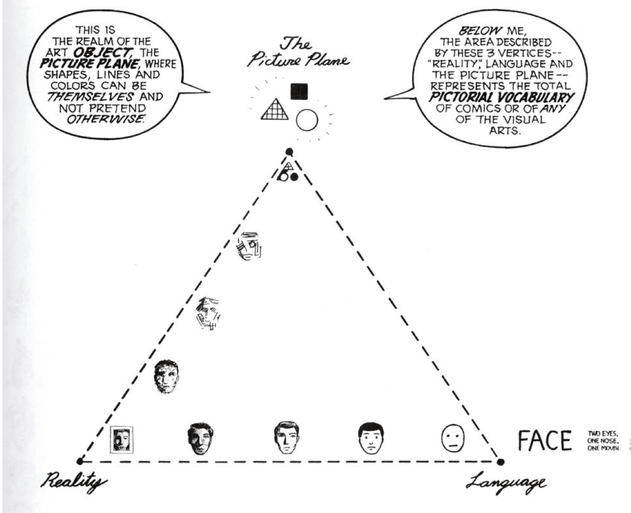
At the top of the triangular diagram is non-representational art, abstraction. At the lower left is photography or ultra-realism. Near the lower right are emoji, even though that term didn’t exist yet: highly simplified drawings with broad, easily understood symbolism. There’s a bit more going on at the lower right point, but we’ll get back to that.
This is a triangle, rather than some other shape, because the closer you get to each extreme, the less any distinctions between the other two aspects matter.

Emoji design seems like it’d be simplicity itself: just figure out the face that more people are likely to recognize as a face than any other, and make that your image for “face.” But these kinds of things are always more complicated than they look at first glance.
Should the face be lightly smiling or not? Should it be completely circular since we respond well to simple shapes, or an ellipse, which is a bit closer to the shape of most human faces? Should it be yellow, like the “Have A Nice Day” smiley face or most of the Simpsons, or should it go for some more naturalistic skin tone…or a variety of such tones? Or just stay in black and white?
Some of the clues in the Ubercross G use a single emoji to signify a certain word. But it’s not a one-to-one relationship. This sign—😃—could mean HAPPY, I’M HAPPY, WOW, HA!, or any “happy” synonym. It’s also basic enough, as emoji go, to stand in for FACE or HEAD. You’d need a crossing word to get it, in that case.
Neighboring the emoji in the diagram is the word FACE. “Meaning retained,” McCloud says. “Resemblance gone. Words are the ultimate abstraction.”
And yet…here are two words. Look at this first one and think of an image…

…and then…take a break, clear your head for a few seconds. Try not to overthink this. And when you’re ready, do the same for this one.

Did you see the same face? Or was the first face you imagined a little younger, simpler, cartoonier? Even the visual way that we present words gives certain shades and meanings to how we interpret them. The first “face” is rendered in a font I’ve used to letter my own comics, and it might get you thinking in terms of simpler, more emotional visuals. The second one feels like it belongs to a more thoughtful, nuanced world. Even if you’ve read a lot of thoughtful comics and some really dumb stuff lettered in Times New Roman, you’re likely to feel somewhat the same.
In short, seeking any “perfect” example of McCloud’s concepts is a bit of a mug’s game. There’s always gonna be nuance, in just about any form of communication. And thank goodness for that.