Writing in Color
Roy G. Biv has a lot to say!

William Faulkner’s The Sound and the Fury is counted among the all-time great novels, but for Faulkner, it was a source of frustration. His original vision for it included a section that didn’t resemble the appearance of any other classic novel: he wanted the “Benjy section” printed in fourteen different colors. (I’m considering black as a color here, as he did.)
He didn’t just want this because colors are pretty. Each color, in his plan, would be tied to a different time period of the story, helping readers sift through the complicated structure of flashbacks in Benjy’s mind. Faulkner was too professional to leave readers with an indecipherable text, but it remained his fond wish to “get it printed the way it ought.”
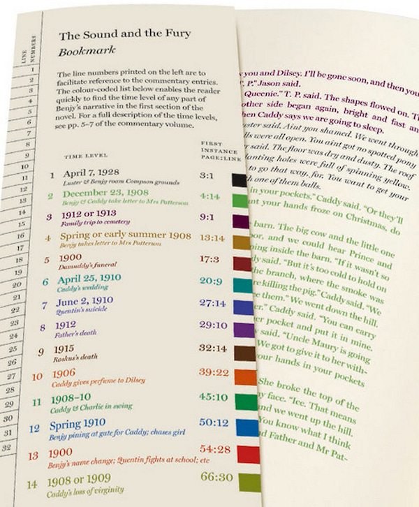
A 2013 edition made Faulkner’s wish come true, 83 years after The Sound and the Fury’s initial publication—too late for Faulkner himself to see it. Nevertheless, this kind of color-coding fascinated me when I learned about it, because I was working my way through another famously color-coded novel—The Dark Knight Returns.
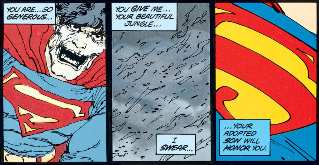
While Faulkner tied color to time periods within one character’s perspective, most comics practice ties different colors to different perspectives, when different color captions are used at all. In an earlier post, I touched on DKR’s use of color-coding for Superman and Batman’s voices:
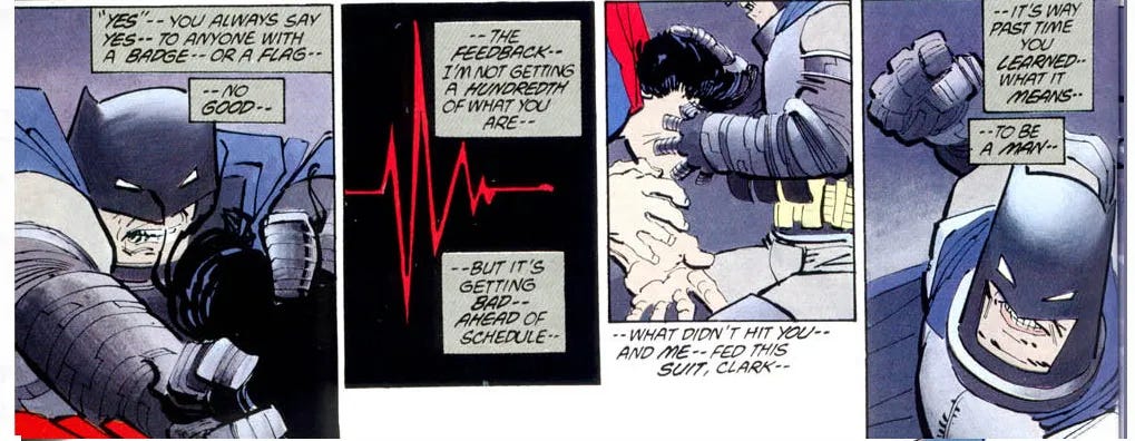
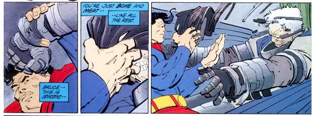
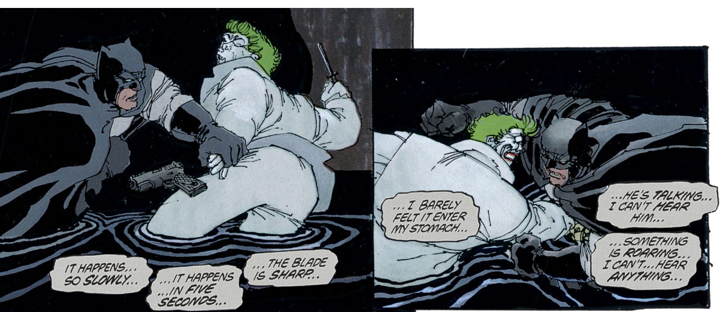
But I could only scratch the surface. For one thing, the graphic novel’s color-coding for Batman isn’t consistent. In the early parts, when his voice is the only narrative voice in the series, it’s rendered as black text on borderless white:
The gray captions only start showing up when Bruce suits up and becomes Batman again, perhaps hinting at a change in his psychology once he puts on the mask. Even then, though, Bruce gets some non-gray captions here and there when too much gray would weigh down the design, but never when that would create any ambiguity about who’s narrating. Robin, the Joker, and Jim Gordon get special caption colors too.
The styled captions for Superman and Batman show further variation as the story approaches climax. They grow more disordered when the characters are at their weakest. The lines of Batman’s captions wobble as he flirts with unconsciousness. Superman’s go from bright blue to pale sky-blue—and back again, when he regains his strength.
One can take this caption stylization even further. Here’s a recent example from a special Fantastic Four issue (released on Free Comic Book Day). The differences in its four captions aren’t limited to color. While Mr. Fantastic’s introductory caption represents the whole team, the other three have designs related to their powers: rocky texture for the Thing, faded near-transparency for the Invisible Woman, flame icon and red and yellow for the Human Torch.
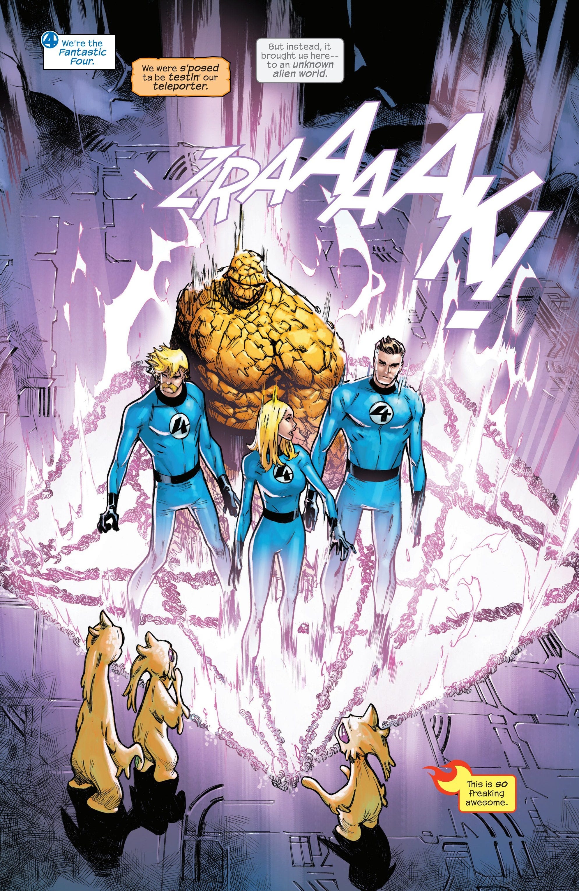
Even the outlines for the first caption might be considered expressive: note that it uses angular corners while the others are irregular or rounded. This may reflect Mr. Fantastic’s character more than his powers: while his body is flexible, his mind is often scalpel-precise, more disciplined and a bit more old-fashioned than the other three.
Most captions don’t need to be this elaborate, and as usual, the danger of getting too clever is leaving the reader behind. Infinity Gauntlet, the miniseries that inspired the last two Avengers movies, also employs multiple narrators, but it uses artistic intros for each character rather than suggestive caption styles.
It can manage this because it has only one narrator per scene, and each scene lasts at least an entire page.
I’m working on something now that combines the last two approaches—stylized captions, with each style introduced one at a time and given a visual introduction that clarifies which character the style belongs to. I think it’ll give the story some bounce. It can enrich almost any narrative to see it through multiple eyes.
Next: The review of crosswords in 1931 begins with an ominous diagnosis…