

Zoo Crew Logo Design (1 of 2)
Every hero deserves to feel like a star.

After the heaviness of my thoughts yesterday, I felt the urge to lighten my heart by going back an old favorite. Or maybe two old favorites, one of them being type design. I’ve indulged in discussing Captain Carrot and His Amazing Zoo Crew here a time or two, but one thing I’ve never discussed is its character logos. They’re more professional than you’d expect from this goofy little series—mostly because they employed a rising star in the business.

In type design, the two major superhero publishers had different approaches. Marvel only commissioned logo designs for series, whereas DC would do so for characters. The Zoo Crew heroes were never going to get solo comic-book series, but in terms of typography, DC still gave them star treatment.
The characters’ appearances (seen above) and their punny names told you a lot about their powers, which were mostly familiar with a funny-animal twist. Pig-Iron was a strongman hero like the Hulk or Thing, encased in metal skin like the X-Men’s Colossus. Alley-Kat-Abra was a sorcerous hero like Doctor Strange; Fastback was a speedster like the Flash or Quicksilver; Rubberduck was a stretchy guy like Plastic Man or Mr. Fantastic. Yankee Poodle’s telekinetic powers were more unusual, but she was rocking the “patriotic” motif of characters like Captain America.
As the leader, Captain Carrot was the most generic of the lot, with powers loosely modeled after Superman’s, so his logo, seen in the top line above, used the simple “projected shadow” found in the Superman logo.

Todd Klein has won more high-level awards as a comics letterer than anyone else—16 Eisner Awards, 8 Harvey Awards—and it’s hard to imagine anyone surpassing that. It was still early in his career when he was commissioned to do logos for the supporting Zoo Crew members.
Having precedent can help or hurt a logo design. If a new movie is pitched as “like Back to the Future for the 2020s,” you might look at Back to the Future’s logo before designing a new one. But then you have to work not to be a cheap knockoff. The logo for Fastback the speedy turtle, for instance, had to follow in the footsteps of the Flash’s logo at the time—but not too close.
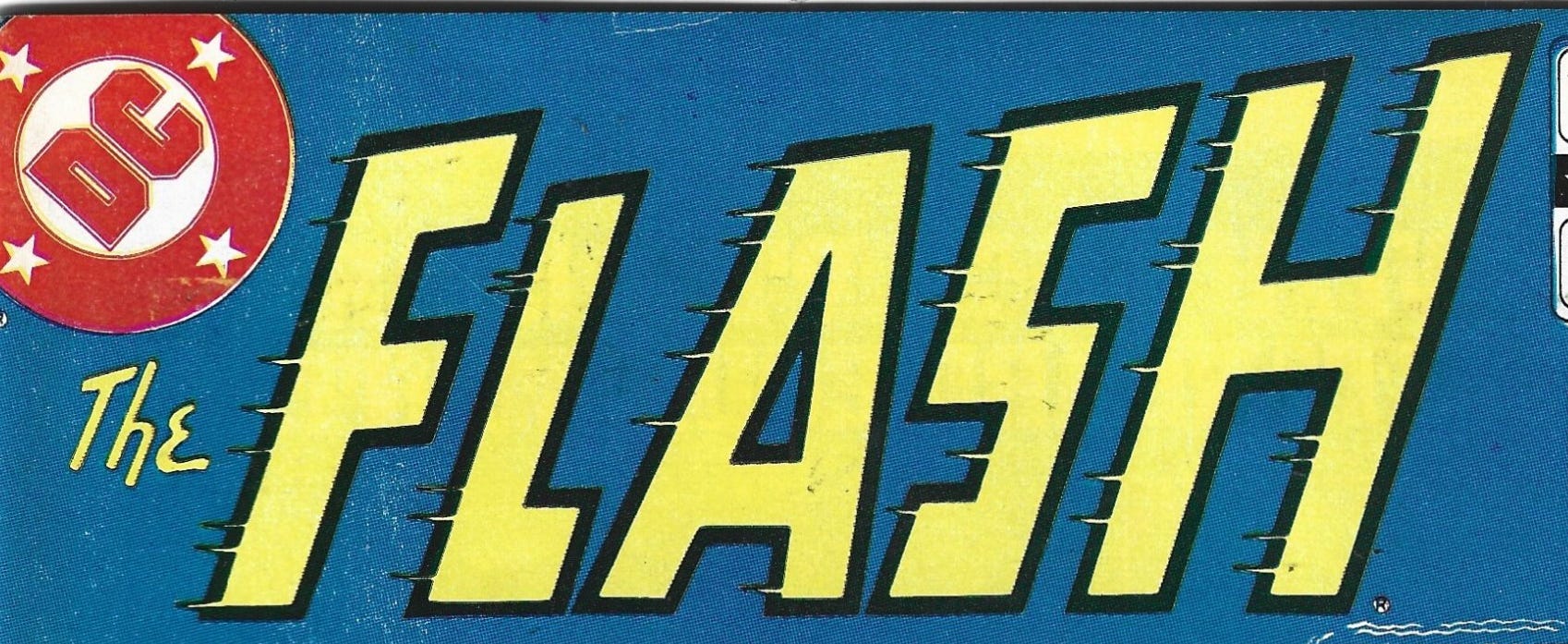
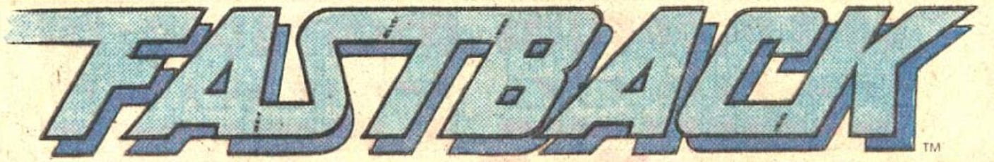
Both logos convey speed with motion blurs and italic slants. “Fastback” has more letters than “Flash,” so those letters can’t be quite as impactful (the “The” in “The Flash” is mostly ornamental). But it innovates by joining up horizontals so that one letter sometimes “rushes” into the next.
The logo is also more character-specific. It uses a drop-shadow to add mass, suiting the comical contrast of the character’s design—he is fast, but he looks chunky. And while some logos varied their colors from appearance to appearance, Fastback’s always reflected his costume—blue to the Flash’s red.
(Warning: SPOILERS) : r/FlashTV")
For the Zoo Crew’s magician, Todd got weird.
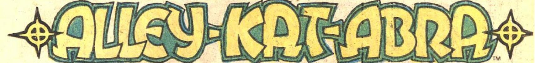
The letters bend, stretch, and overlap with each other. Note the differences in the four A’s—that’s the kind of “character” most font-derived design doesn’t feature. (The capital A’s lean left, the lower-case ones lean right, but there’s variation even within that.)
The yellow barbed circle bracketing the logo is an icon specific to the character, a “twinkling” effect seen on the tip of her wand and mirrored by her belt buckle.
 | DC Database | Fandom")
Doctor Strange has had many logos over the years, and those logos’ letters have sometimes “misbehaved” too, but not in such a broad, cartoony way.

It can be a challenge to “mutate” letters like this: go too far and you end up sacrificing legibility. But Klein was up to the challenge.
More tomorrow!