

Zoo Crew Logo Design (2 of 2)
Letterforms for several more super(script) types.

Last time out, I went through a few of the type designs of Todd Klein, a legend in the field, when assigned to promote the not-so-legendary members of the Zoo Crew. There were a few other members he worked with, and each of them was an animal parody of a certain species of superhero.

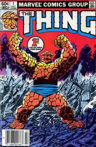
Some superheroes are all about strength, to the point where they come off less aspirational, more crude and destructive. As you can see above, logo designers suggest those characters by giving them bulky letter forms mimicking crude, unforgiving materials like brick and stone.
Pig-Iron below is likewise a strongman type (though the word “man” has a loaded meaning in his talking-animal world, where “human beings” are scary mythological beasts). He has steel skin, which suggests a related but still distinct angle to take his logo. But the playful use of nuts and bolts changes the tone, which suits not only the series but the lighter mood of the character. The Hulk and the Thing are haunted by their monstrous forms; Pig-Iron sees his transformation as a dramatic improvement.

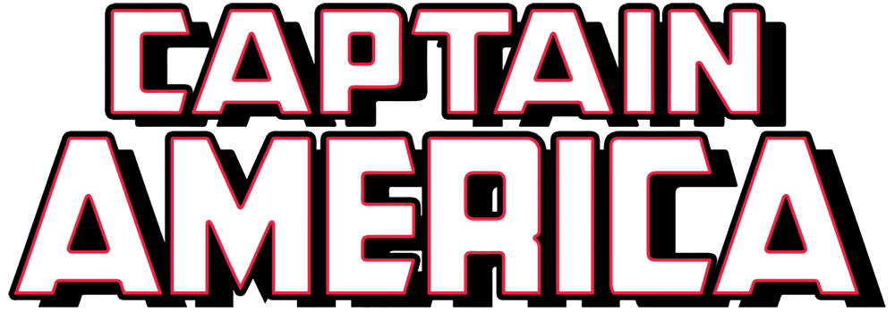
Patriotic heroes in the U.S. have lots of red-white-and-blue, stars-and/or-stripes imagery to draw on. Here’s how “Captain America” looked at the time.
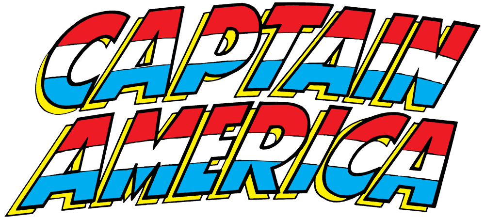
Notice how the letters “wave” slightly, like the flag. Those red-white-and-blue stripes could be read as invoking the French flag, but the context brings the reader to the intended conclusion.
This logo does a balancing act, working in a little patriotic imagery but still maintaining the “power” that letterforms needed to sell superheroes in the 1980s market. Modern treatments can sometimes get more sophisticated, but they still only use a light sprinkling of flaglike imagery—or sometimes eschew it altogether.
Yankee Poodle is another “patriot” superhero, but like Pig-Iron, she differs from her inspirations in personality. She’s shallow, vain, and a bit “ladylike” by superhero standards—

So her design gets to be more ornate and elaborate, with 22 stars, five stripes, and delicate letter outlines like you might find in cross-stitching:

Last comes Rubberduck. (You can skip reading the copy in the image here, it’s not that relevant.)

Stretchy superheroes often provide a bit of comic relief even when they’re not talking animals; they’re fun to render on the page! Plastic Man was a broad superhero parody on his own, and both he and the Elongated Man served in the Justice League as foils for the more “serious” members. Even Mr. Fantastic and Ms. Marvel, who weren’t jokesters on the whole, could end up in a goofy sequence now and again.

But did that humor translate into logo design? Not as much as you might think. Here’s the logo from the contemporary Plastic Man cartoon series, based on earlier comics. The letters are rounded and “stretchy” compared to the blockiness of most early hero logos, true. But it’s pretty subtle and restrained compared to most aspects of Plastic Man’s adventures.

Klein pulled off a much wilder idea, shattering the fourth wall so that Rubberduck himself created his logo—out of his own stretchable neck.
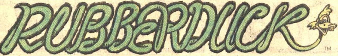
Or possibly his entire body? One way or another, that’s a new definition of power in design.
Next: That’s the last look at the silly comics of my youth for a while, I promise. We’ve got Word Ways records to update!