


A Small Font of Humor
Laughing in your typeface.

Can you find the visual pun in these two images? Here’s a hint: it combines something about their content and something about their design.
…
Give up?
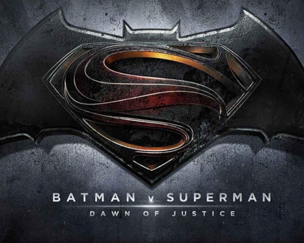
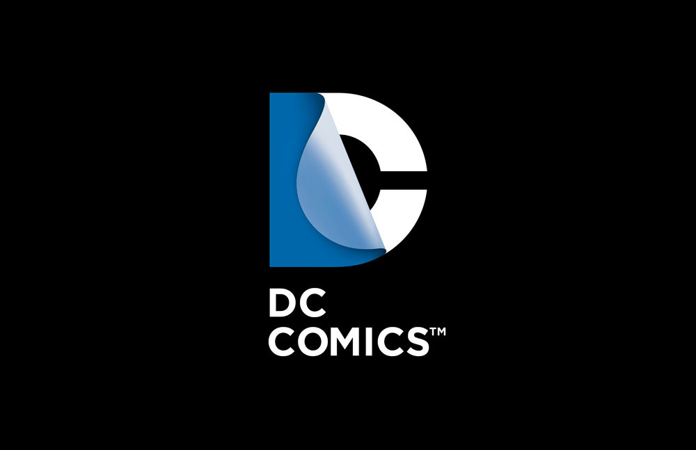
Both images relate to Batman, the superhero who lives in the city of Gotham…
…and both of them use the Gotham font. (Or at least they’re close enough to it that they probably used it as a basis. A lot of logo designs are tweaked at least a bit for trademark purposes, but the ones used here are pretty much Gotham.)
Ahhh? Ahhh?

Weirdly, I’ve more recently seen “DC” in the Gotham font at a science-fiction convention, where there were many comics to be seen…but not with reference to DC Comics. Instead, this time it referred to Washington, D.C., the real-life city.


As material for jokes goes, this is a fairly shallow vein to mine. The average well-educated reader has probably seen a few font/typeface names like Helvetica and Garamond, if only when using a word processing program. But not too many such names are widely known. And some of the ones that are known—like Helvetica and Garamond—don’t have any homophones, near homophones, or secondary meanings to cross over.
But looking carefully, I was able to find a few more examples. Here’s a logo that looks close to Arial, which sounds like aerial:
And one based on Gill Sans:
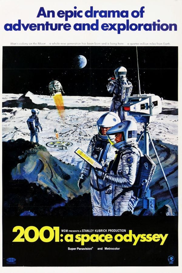
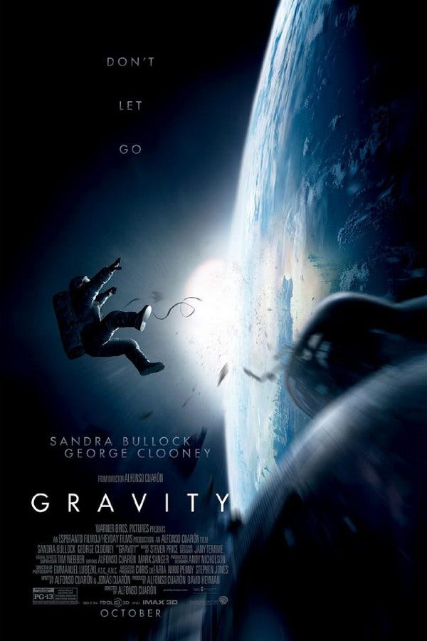
I’m not sure if the use of Futura on the posters below really counts, but let’s give it the benefit of the doubt.
That’s about as far as I can take it, though. There’s no T-shirt line appealing to Southern pride with a logo in Georgia Bold. No baby sleep aids with branding in Rockwell. And there’s no TV show about a time-travel-displaced Roman centurion called Time’s New Roman, with a Times New Roman title to match.
Although maybe there should be. Know anyone at Netflix who’s still taking pitches?


What an unusual mind you have to make a connection between typefaces and graphic
correspondences! Good work.
Why did you break up with Pica?
Not my type.