


Ambigrams in the Wild
Turn that noun upside-down!


Ambigrams are one of the railway stations where the world of words meets the world of art. In simple terms, an ambigram is a design of letters that can be read in more than one way.
In most of the best-known ambigrams, the multiple “readings” lead to the same result. If you look at these title designs right-side up, and then look at them upside down, you’ll see they haven’t changed at all. In other words, they have rotational symmetry, just like the “ambigram” example from Wikipedia above:
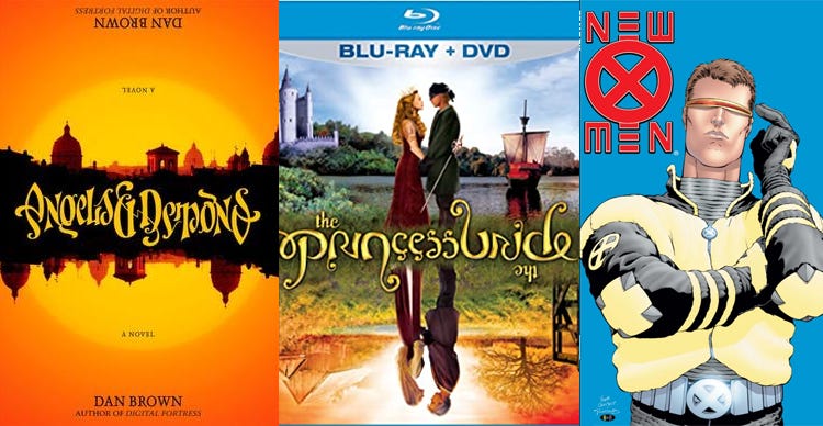
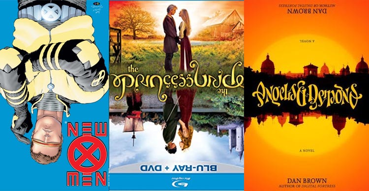
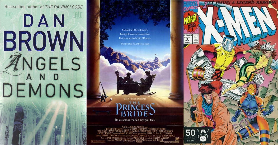
These three ambigrams show three different approaches. The distortions in Angels and Demons have an ornate, calligraphic quality, recalling old illuminated manuscripts. This matches the book’s obsession with old church documents that might have secret meanings and alternative readings. There’s an ambigram within the story, too.
In Princess Bride, the ornate, looping letters seem to be made of ivy, which is more appropriate to the film’s rural heart. The DVD cover divides the lovers’ two realities, one of idyllic innocence, one of epic adventure…but the reversible design sends the message that in the end, their essence and their love remain deep and unchanged.
The New X-Men title is very close to a natural ambigram: if you turn the letters in “NEW X MEN” upside-down, they’ll read something like N3W X M3N. So all designer Richard Starkings had to do in this case was simplify the “E’s” and give it a more vertical, X-centric design than seen in standard comic-book logos, then and now. This advertised the creative intent behind the series: This is still “X-Men,” but it’s not quite how you remember it. Long-running comics titles need such self-reinventions now and then, just like pop stars.
All three of these properties exist both in print and onscreen, and all three of them are often marketed without ambigrams. It’s not hard to see why. As beautiful and arresting as an ambigram can be, it’s usually harder to read than its straightforwardly lettered counterpart. Often, designers will want to keep the typography simpler and put more focus on other elements.
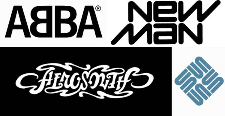
But there are other cases where ambigram logos are not competing with any such images for attention, as in music (Aerosmith and ABBA—which uses mirror symmetry instead of rotational symmetry), fashion (New Man), and Silicon Valley (Sun Microsystems, whose logo has four-way rotational symmetry). In those cases, the ambigrams get a lot more play.
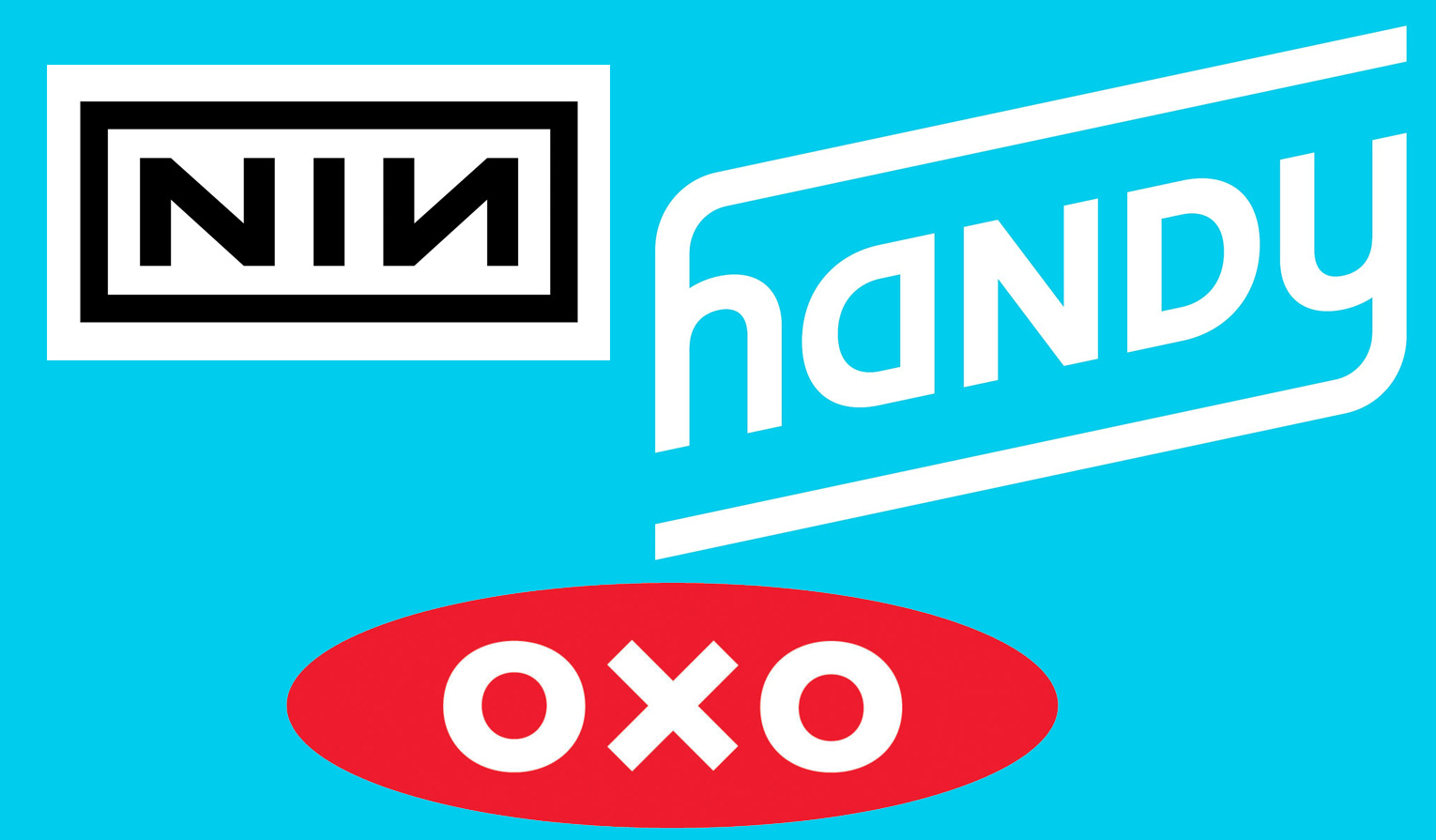
Rounding out this “top ten,” here’s one more from music, following ABBA’s example (for Nine Inch Nails), plus a rotational logo for the home-improvement marketplace Handy—and OXO, a cookware brand that has natural mirror and rotational symmetry. Wikipedia’s extensive article covers these examples and others.
There are other kinds of ambigrams (John Langdon, who created the form, has a longer list), but these are the ones I’ve observed in day-to-day life, not just as a graphic exercise for the sheer beauty and interest of it. Have you run across any others like that?


One that I have always thought SHOULD be an obvious (double) ambigram is Winn-Dixie (grocery store chain and/or sad children's book). Winn and Dixie are both very, very natural ambigrams, to the point that I am shocked it is just coincidental.
Did you see the NY Times crossword for today (June 6)?