


Moby Dick Covers, Ranked
From the bigger fish to the fail whales.

I spent Tuesday getting my Library of Congress card and doing some preliminary research there; after that, I ended up at a nearby Barnes and Noble. Among the books I flipped through was The Look of the Book by Peter Mendelsund and David J. Alworth. It’s all about book cover design, and that got me thinking of doing another book-cover comparison study.
Moby Dick, sometimes listed as Moby-Dick or with its alternate title The Whale, has had many covers in its existence. Here are a few that struck me as especially good or especially bad, sorted from best to worst.

Bill Sienkiewicz is one of my favorite comics artists, his career dedicated to the idea that museum-quality, abstract-edged painting can tell stories as well as traditional cartooning. In this whale-free cover, Sienkiewicz focuses on the haggard Ahab, his sight-line turning into a meandering path for his vessel, with the map’s X showing Moby’s location. This blend of portrait and cartography is an artsy approach, but it brings out the profound, compelling obsession of the character.
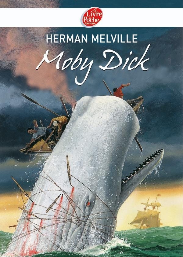
A lot of Moby Dick covers promising big action, but this foam-flecked illustration is hard to top. The five harpoons, the endless snagged lines, and the copious blood makes it seem like the crew may’ve had a chance at bringing Moby down…until right now, the exact moment that seeming chance goes up in smoke.
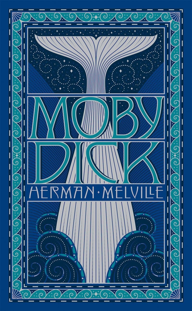
Although Moby Dick was written in the 1800s, it didn’t really become popular until the 1920s, the age of Art Deco. This intriguing, symmetrical design of the whale’s tail evokes the design motifs of that period (and an earlier cover, as seen below).

Rockwell Kent was a finest illustrator, whaling researcher, and adventurer. Most of his drawings were black and white, but this 1930 edition puts the best Moby shots into duochrome.

This one’s got great scale difference between the whale and the boat and dazzling color. The whale is eyeless in this rendition, and that reminds me of one of the book’s memorable observations: a humpback whale’s eyes are on the side of its head, so when Moby approaches you, all you see of his “face” is a featureless wall. Or is the “O” in Moby meant to be the eye? The typeface choices look odd and ill-considered, but that’s my only complaint.
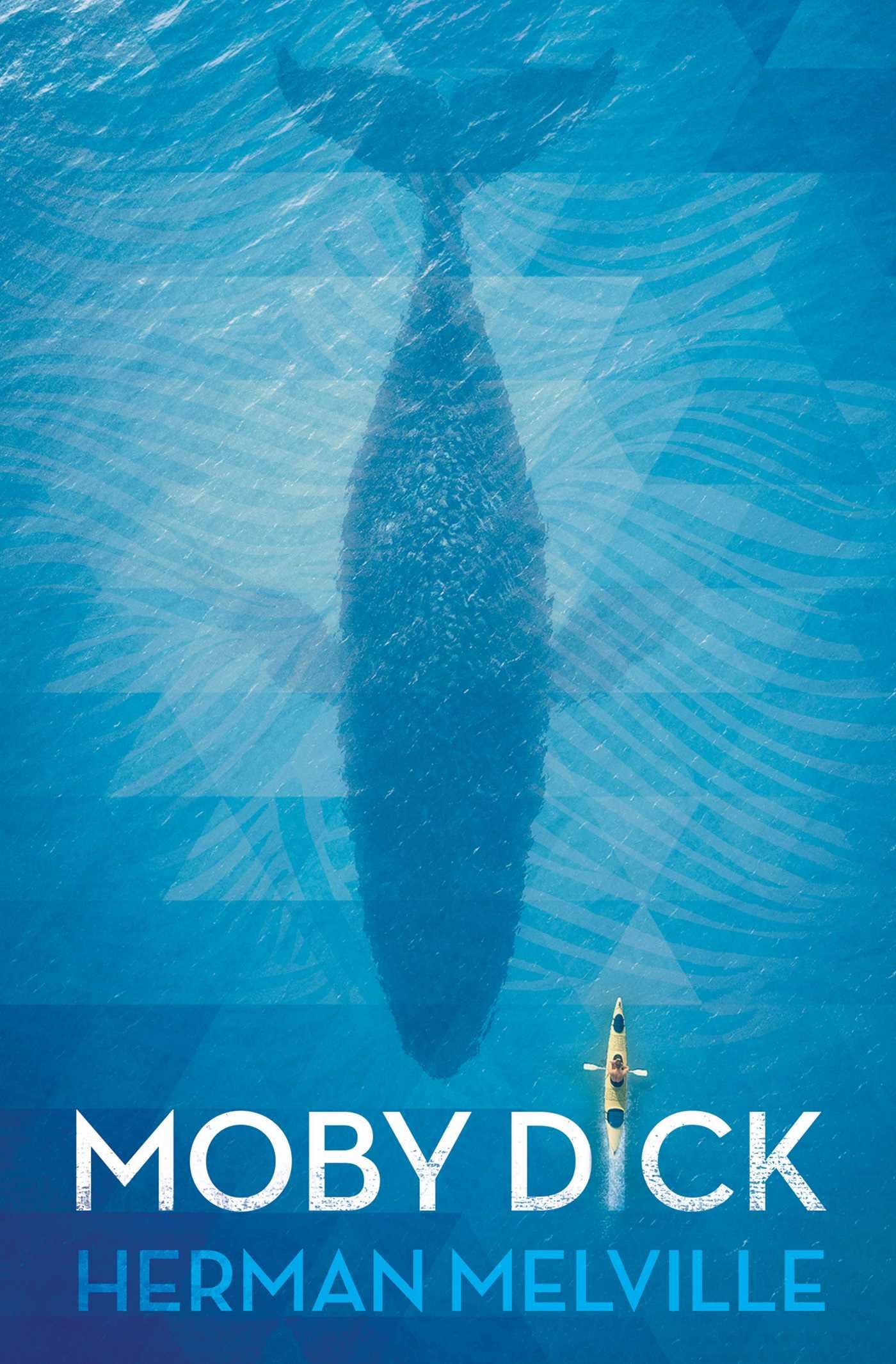
With its view of the surface of the water and a predator coming up from the depths, the prior illustration recalls the famous Jaws poster. Putting its boat on the sea over a vast expanse, this one recalls the best-known cover of Life of Pi. The shadowy, monstrous whale dwarfing the vessel in place of Moby Dick’s “I,” seems like a great idea.
But then you look closer and the whole thing falls apart. That is not the right species of whale, and that canoe is clearly not any kind of whaler’s vessel.
Um, spoilers?
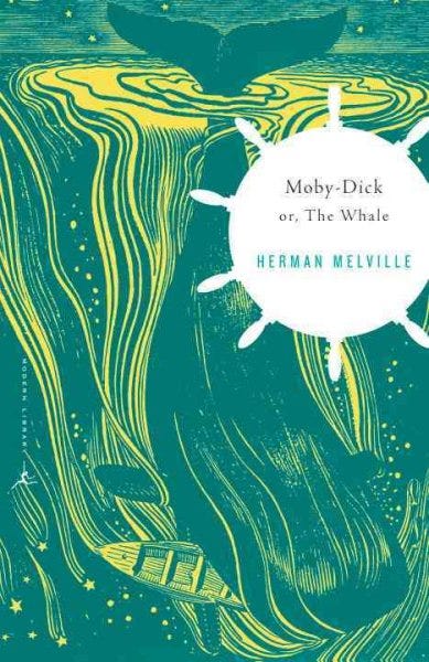
This is another Rockwell Kent illustration, recolored to represent the ocean depths. And it looks great, but it gives away a little too much. Sure, modern readers probably already know how Ahab’s quest will end, and the book itself gives plenty of ominous hints. But still.

I’ve griped about this project elsewhere already, but the issues with it are right on the cover. We expect more from emoji today than for them to be pixelated and barely decipherable. And a blue whale? The whiteness of the whale is pretty key to the world of the story. At the risk of repeating myself, this book should have tried developing its own emoji, not using others’.

The first edition of Moby- Dick; or The Whale had nothing on either cover but a publisher logo. It feels unfair to put it in competition with modern cover design, because it wasn’t really trying to hook the reader as modern covers do. But I’m glad that no-design age is behind us.

…
Did you know that just about anyone can put out an edition of a classic book that’s in the public domain? This is a real e-book cover, and what’s more, it’s not close to being the only one that confuses “The Whale” with a shark. Goodreads reports there are 12,531 editions of the book…and counting, I’m sure.


